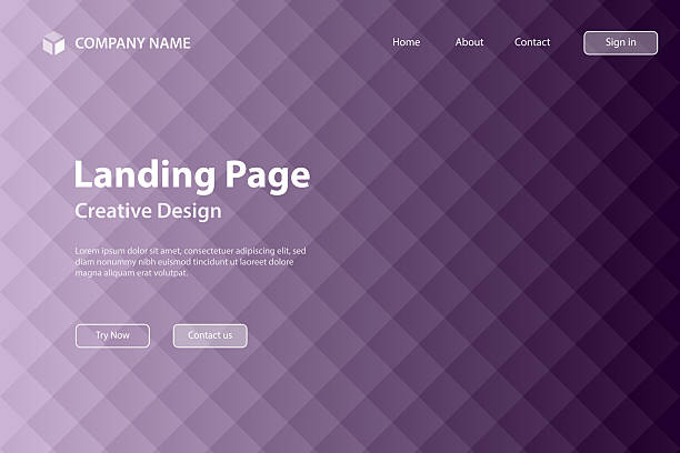
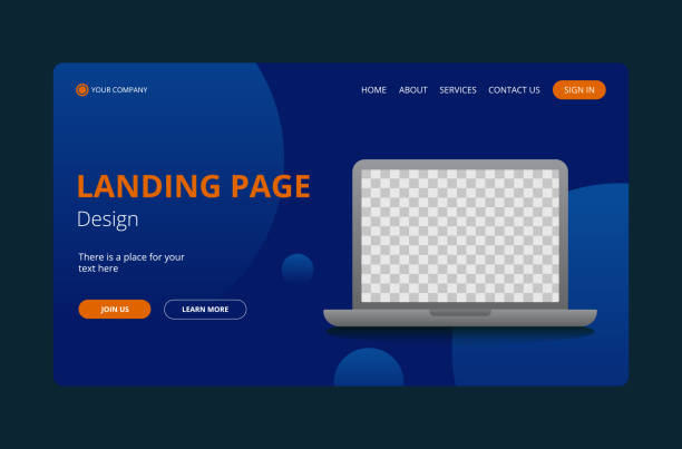
A landing page is the most essential salesperson in the digital world of 2026. It is a web Landing page that has been created with one purpose. That could be collecting an email subscription, selling a product or a consultation call appointment. A landing page does not have any distraction such as menus or side bars as in a full site. This makes the visitor preoccupied with your offer.
As a novice, it may be difficult to make a page that literally converts visitors into customers. Nevertheless, effective Landing pages tend to be based on an extremely simple and established formula. Through studying the best examples, it is possible to understand how to organize text and images in the most effective way.
The Simple Lead Magnet Page
A lead magnet page is created to provide something free in exchange for an email address. The most widespread beginner type of landing page is this one. The best example would be a Checklist or E-book download page.
- Clear Header: The title clearly informs you of what you are getting, like the example given below:Download Your Free 2026 SEO Checklist.
- Single Field Form: These Landing pages typically require an email address only in order to maintain a high conversion rate.
- Visual Preview: This is a small picture of the digital product which allows the user to visualize what he is getting.
- Zero Navigation: This means that there are no links to other Landing pages, and hence the user is obliged to sign up or quit.
The SaaS Landing Page of Problem-Solver
Such Software as a Service (SaaS) websites as Notion or Canva have perfected the landing page. Their pages are aimed at resolving a certain aggravation to the user. They do not enumerate all the technical features but demonstrate how easier your life will be. As an example, a project management tool may say, “Stop Chasing Your Team for Updates.
This headline strikes a pain point that the visitor experiences on a daily basis. They present a short video with the headline or a looping GIF to demonstrate how the software works. This creates trust in that the user will be able to see the product even prior to them signing up. The visitor can only get to the bottom of the Landing page and feel that he/she is understood.
The Registration Page to the Webinar
Webinars are massive in 2026 to gain authority and sell high-ticket courses. The primary necessity of a high-converting webinar Landing page is fervor and FOMO (Fear Of Lost Out).
- Live Clock: To make a sense of direness, a live clock shows the number of hours remaining some time recently the occasion begins.
- Speaker Bio: Photographs and brief bios of the experts make moment validity among the audience members.
- Bullet points: Incorporate a list that displays precisely what the viewer is going to know, e.g. 3 Secrets to Passive Income.
- Social Proof: To demonstrate that 500 other people have already registered gives people an incentive to join the crowd.
The Single-Product e-commerce Page
When you are selling a tangible good, your opening Landing page has to be very visual. Small catalogs that specialize in one product tend to lose to small stores that concentrate all the efforts on one product. An example of a high-quality Smart Water Bottle is given. There is a beautiful image of the bottle at the top of the Landing page which is a hero image of the bottle at a lifestyle scene. When you want to scroll, you can notice the benefit icons explaining such features as temperature regulation or integration of an app.
Such pages tend to incorporate sticky buttons which remain on the bottom of the screen when scrolling. This is to say that the Buy Now button can be tapped at all times. In 2026, it is necessary to add on these pages customer video reviews. When a real person uses the product, it creates more trust than one thousand words.
The Booking Page of the Professional Service
In the case of coaches, consultants and local businesses, it will be the attraction of a phone call. These are Landing pages constructed on the basis of the “Consultation” model. The example of a fitness coach would be especially good. The title can be “Lose 90 Days to Your Dream Body without Quitting Pizza. It sounds fun and achievable. The pages contain excessive amounts of social proof, including before-and-after images of actual customers.
They do not have a long form but instead have a simple calendar tool such as Calendly. This enables the visitor to choose a time to make a call on the page. You eliminate the strain that prevents people from contacting them by making the booking process simple.
The Comparative Us vs. Them Page
There is always competition in the market and you must prove why you are better. The Landing pages called Us vs. Them are highly converting as they assist the user to make the final decision. Through these pages, there is a huge table of comparison. On the one hand, you enumerate your features and benefits. On the other hand, you demonstrate the failure of the “Typical Competitor. As an example, a VPN service can display that they have logs of No and 24/7 Support, whereas others do not. This will give confidence in the users who are at the research phase to select you.
The Waitlist Page of Education
A waitlist Landing page can be used before a product is even released to start gaining an audience. It is an excellent way for beginners to try out an idea, prior to investing in it. The page is very simple. It describes a future product and provides some form of pre-release or a discount on launch to individuals who sign the list. This produces an exclusivity feeling. Humans enjoy the ability to be the first to do something. You will be able to promote this Landing page in social media and see whether people are really interested in your idea. When thousands of people are registered you know you have a winner.
Conclusion
In 2026, it is all about clarity and trust when it comes to building a high converting landing page. It should not be a concern of whether you are giving a free guide or selling a luxury product, but one should always focus on the needs of the user. Be brief in your sentences, headlines, and clear pictures can direct your visitors to the checking point. Do not forget to use successful examples such as Canva or Netflix to observe how they make things simple. Now, do not be too smart with your design. Rather, be as clear as possible of what you are offering and why it is important.